Documentation
Version BETA 0.1.0
Last update 23.03.2025
REM SETTINGS
REM — a relative unit in CSS that helps create more accessible and scalable websites. It refers to the font size value in the HTML element, which is taken from the
browser's main font size settings. By default, this value is 16px.
Example in CSS:

In sf-starter, the default font-size for the HTML element in CSS has been set to 62.5%. As a result, the default font size is now 10px (instead of the
standard
16px).
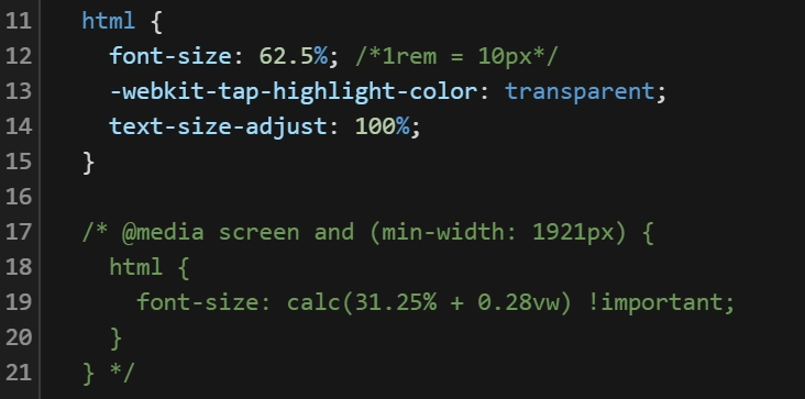
Optional: scaling above 1920px
Below 1921px the root font-size stays at 62.5%, so 1rem is always 10px and the
layout keeps a fixed scale. If you want it to keep growing on larger displays, add this rule.
The root size then follows the viewport width, and every rem in the project
follows with it — you do not have to touch a single component.
@media screen and (min-width: 1921px) {
  html {
    font-size: calc(31.25% + 0.28vw) !important;
  }
}
The values are picked so the scale is continuous: 31.25% of the browser default 16px is 5px, plus 0.28vw, which at 1920px is another 5.38px — so 1rem starts at about 10.4px exactly where the 62.5% rule ends, and grows from there. On a 2560px display 1rem is about 12.2px.
Benefits of this change:
-
Easier REM unit calculations and more readable code. Instead of converting sizes, you can write values in
remas decimal equivalents of pixels, e.g.:font-size: 16px → font-size: 1.6remfont-size: 24px → font-size: 2.4remmax-width: 1440px → max-width: 144rempadding: 48px → padding: 4.8rem -
The ability to set the default
font-sizeon thebodyto 1.6rem or another value, simplifying font size inheritance for other text elements. -
Better collaboration with designers — in tools like Figma, font sizes are provided in pixels.
Remember
Remember the new value font-size: 62.5% for the HTML element. Pay special attention to areas where external scripts from other companies are implemented on the
site,
such as chatbots, cookie banners, which may rely on the default value of 1rem = 16px. This could result in smaller sizes.
Popular tools like CookieBot or chatbots display sizes correctly because they use pixel units instead of rem. Therefore, such cases should be rare. If you encounter issues with
incorrect scaling, you can override the CSS styles using !important. As a last resort, you can use transform: scale(1.6) with the
appropriate
transform-origin — although this may not always work.
If your components use the default browser font-size, you'll need to adjust them to the new rem value. Multiply them by 1.6.
Class Naming
We distinguish three types of class naming:
Global Class — these are general-purpose classes used multiple times in different parts of the project. Class names are written with ("-"), for example: text-align-center , spacer-36 . They can be used as a combo class.
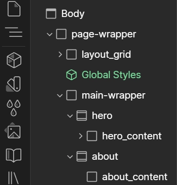
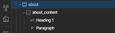
Custom Class — used to define the structure of sections, components, and specific elements. Class names are written with ("_"), for example: about, about_content, about_cards, about_cards_item.
Combo Class — an additional class added to an existing base class. It inherits the styles of the base class and then extends them with new properties, allowing for appearance modifications without changing the base class styles, for example: button, is-large. It is written as is-"name".
Section Naming Rule (semantic tag) and their first elements / first-child
Section
— ideally named with a single word. If it's a header, add a class like
header or hero.
If it's an "about us" section, use the class
about.
First element /
first-child
— written as
"name"_content.
If it's a header, add a
div
with the class
header_content
or
hero_content.
In the case of
about,
add a
div
with the class
about_content.
Auto Container
page container / page container - for a website, it is a structural element used to organize and limit the width of the content on the page.
Semantic HTML Tags - these are elements that describe the meaning of their content to both browsers and developers. Semantic tags clearly define the function of a section
in
the document and help with SEO.
The semantic tags include:
nav,
header,
section,
footer
and others, which we will not focus on in this section:
main,
article,
aside,
figure,
mark,
figcaption
The automatic container system adds appropriate CSS styles to the semantic tags [nav, header, section, footer] and the first element/ first-child without the need to manually add additional classes or structures. This enables the creation of clean HTML code and easier maintenance.
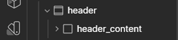
How the auto container works with the header section example
1. The header will have padding-left and padding-right applied.
2. The header_content will have width, max-width, margin-left, margin-right applied.
Benefits
-
No need to create additional div elements for containers, which would cause nesting that complicates the readability of the HTML layer.
-
Ability to apply CSS styles to the first element/ first-child of the semantic tag.
-
Correct functioning of
position: absoluteon the first element/ first-child . -
Easier creation of sticky content in a section using
sticky.
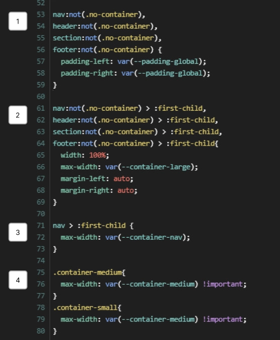
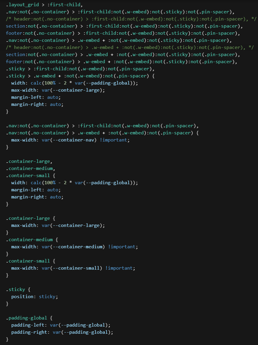
Auto container CSS (1/2):
1. Adds styles padding-left, padding-right to the semantic tags nav, header, section, footer that do not have the .no-container class.
2. Adds styles width, max-width, margin-left, margin-right to the first element/ first-child .
3. The nav has a separate variable for max-width . It can take the same value as the container-large variable.
4. The width of the container max-width can be changed for unique sections by adding the combo class container-medium or container-small to the first element/ first-child .
Variables var(--name) are declared in Variables .
Remember (1/2)
1. If the starting tag is div , the auto container style will not be applied. Add the appropriate tag in the panel on the right: Settings > Tag > [Nav, Header, Section, Footer] . The section can be added directly as a section instead of a div .
2. The auto container styles will only be applied to the first element/ first-child inside the semantic tag. Therefore, it must be at the top, except for the classes sticky and pin-spacer .
3. If you want the auto container styles not to be applied, add the class no-container to the section.
Auto container CSS (2/2):
1. Auto container styles are also applied to the helper grid with the class layout_grid .
2. Protection for sticky and pin-spacer (GSAP), which applies styles to the first element/ first-child without the sticky or pin-spacer classes.
3. If the first element/ first-child has the class .sticky , the padding-left and padding-right applied to the semantic tag will be reset and applied directly to the div with the sticky class.
Remember (2/2)
If you are using other animation libraries, make sure they do not add additional div elements that will then become the first element of the semantic tag, and exclude them by adding :not(".name-class") in the CSS rule.
2. The class name sticky is reserved. Do not use it for anything other than pinning section content.
Embeds are skipped
In Webflow, <style>, <script> and raw HTML go into
Embed elements, and Webflow marks every one of them with the .w-embed class.
Auto container ignores those: if an embed sits first in a section, it does not become the
container. Otherwise an invisible <style> block would take the container
width and push the real content down.
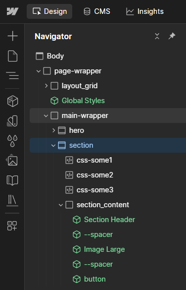
The container moves to the first regular element that follows, so you can stack as many
embeds at the top of a section as you need. In the example next to this text, three embeds
open the section and the container lands on section_content.
It works the same in nav, header, section,
footer and inside .sticky — the rule excludes embeds with
:not(.w-embed) and catches the next element with
.w-embed + :not(.w-embed).
Example with Sticky
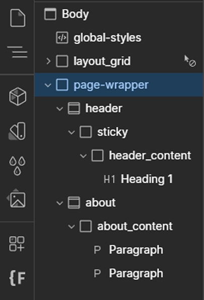
The sticky class was created to easily manage pinned sections on sticky . Thanks to the CSS rules mentioned above, you can easily pin the entire section's content (for example, with a background-image ) that spans the entire width of the page and considers appropriate padding-left and padding-right .
1. Create a header section with the class header , in the panel on the right, add the
semantic
tag
Settings > Tag > Header . Add style height: 200vh
2. Inside the header , create a div with the class sticky ,
and
add the
combo class is-sticky-header . Add styles height: 100vh , position top: 0, background-image:
3. Inside sticky , create a div with the class header_content .
4. Create a new about section, add styles height: 100vh , background-color: white , z-index: 2 and
margin-top: -100vh
Variables
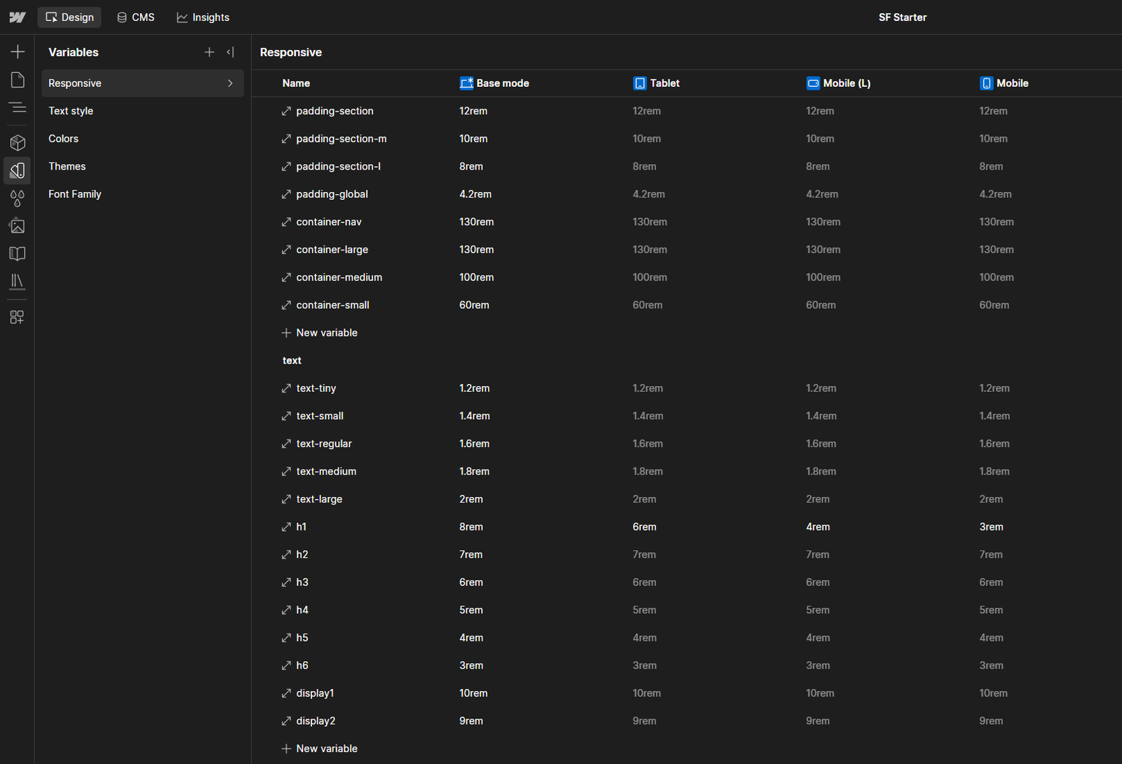
When starting to work on the website, begin by filling in the Responsive variables. This folder contains all the variables needed to create the Auto Container styles, as well as those that may change depending on the page breakpoints.
padding-global → the padding-left and padding-right properties, in the Auto Container .
container-nav → the max-width property in the Auto Container .
container-large → the max-width property in the Auto Container .
container-medium → the max-width property in the Auto Container .
container-small → the max-width property in the Auto Container .
padding-section → the padding-top and padding-bottom properties used in a section or its first element/ first-child (more details in the section Spacer / Padding / Margin ).
Note
1. container-medium and container-small are variants of the main container-large . Add them as a Combo class to the first element/ first-child , if any section has a different max-width .
2. You can add your own variables and remove unnecessary ones.
3. For full-width pages, replace the container-large variable with a percentage version.
In the variable collection Text Style, set the remaining variables for text.
Other styles, such as text-transform , are declared in the Style Guide .
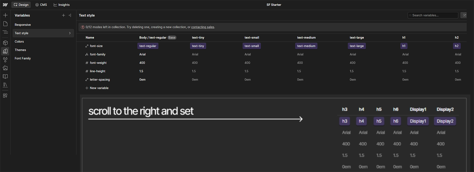
All typographic variables already have variables assigned to the appropriate tags:
Body (All Pages) ,
All H1 Headings -
All H6 Headings
and classes:
display1 ,
display2 ,
text-small ,
text-large .
The rest of the text styles inherit from body .
Setting Variables Process (h6)
1. Create a heading h6 , then in the Style selector choose All h6 Headings and set the text style to h6 .
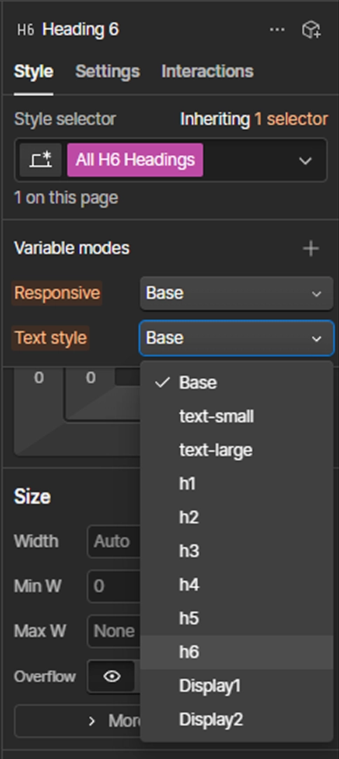
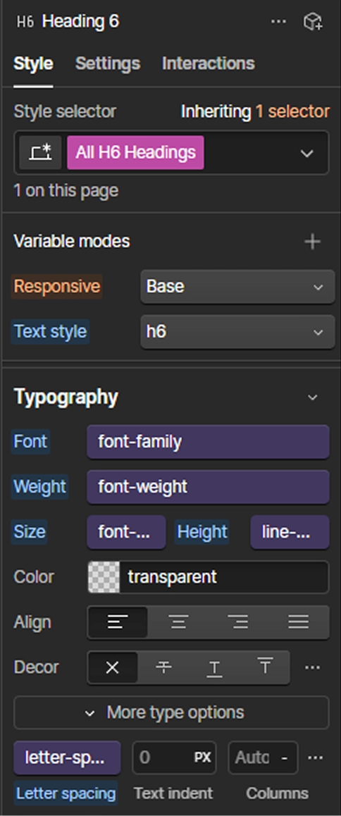
2. Set the Font , Weight , Size , Height (line-height) , Letter-spacing by clicking the purple circle, which will open a panel with available variables. Select the appropriate variables from Text Style .
Variables / Colors
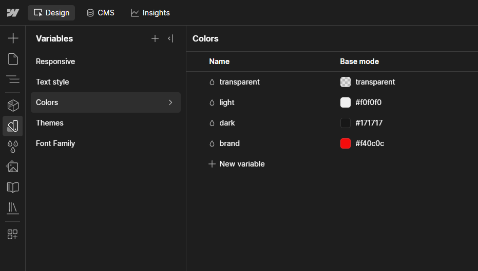
All color variables are defined in a single collection Variables / Colors . There are two groups: Main and Color Vars .
Main - this is a group of variables assigned to color variables from Color Vars with Invert Mode . It is from this group that you will set color variables in the main styling panel on the right side in Webflow.
Color Vars - this group contains all the colors that will be used in the project, which will be assigned to the appropriate variable groups from the Main group.
Setting Invert Mode for selected sections
1. Create a section about > about_content > heading 2 + paragraph .
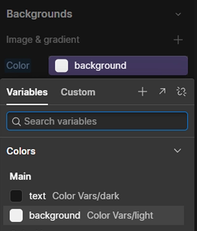
2. In the about styles, set Backgrounds by adding a variable through clicking the purple circle and from the Main group, select background .
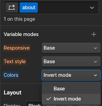
3. Then, add Variable modes / Color to the about section and set Invert Mode .
The result is the inversion of colors for the selected section
1
2
3
Spacer / Padding / Margin
sf-starter has been designed in such a way that as many styles and global classes as possible are created on the fly, without the need to declare their properties beforehand. Each spacer, padding and margin is declared during the project build.
Exception
padding-section → the variable is declared in Variables / Responsive . It refers to fixed spacing inside sections by setting padding-top and padding-bottom .
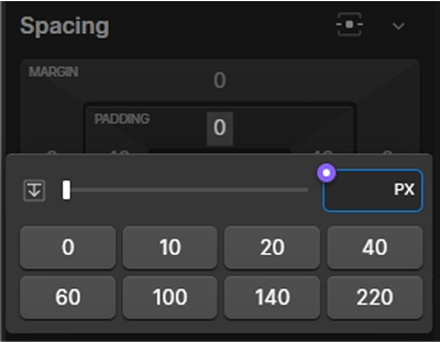
Setup method: select the class of the first element ( first-child ), for example header_content , and add the variable in spacing > padding-top and padding-bottom , by clicking the purple circle. A panel will open with available variables, choose padding-section .
Remember
Spacing padding-top and padding-bottom in sections can be added through the padding-section variable or by directly entering a value. for example: 16.4rem = 164px.
Spacer
A spacer is a global class that you create when you want to add spacing between elements. It involves creating a div and setting padding-top to a chosen value.
Numbers → in the class name, represents the number of pixels, for example: 27 = 27px = 2.7rem
Letters → in the class name: d - desktop, t - tablet, l - landscape (Mobile L), m - mobile
Set
( padding-top )
class name
spacer-36
Class name,
variable for mobile
spacer-d48-m16
or Combo Class e.g: spacer-48 m-24
Class name,
variable for breakpoints
(this rarely happens)
spacer-d48-t38-l32-m16
or Combo Class e.g: spacer-48 m-24
Naming spacers with a double hyphen
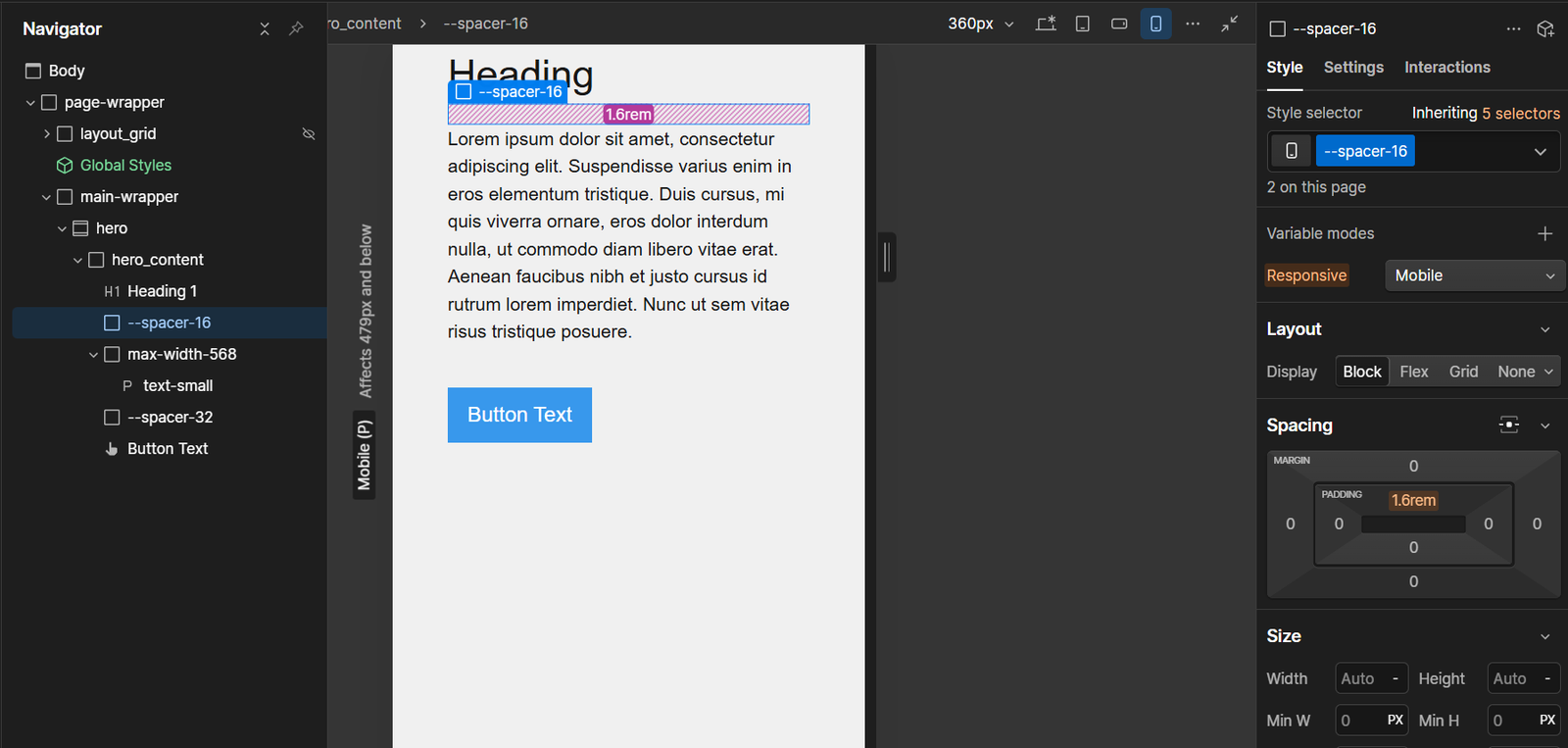
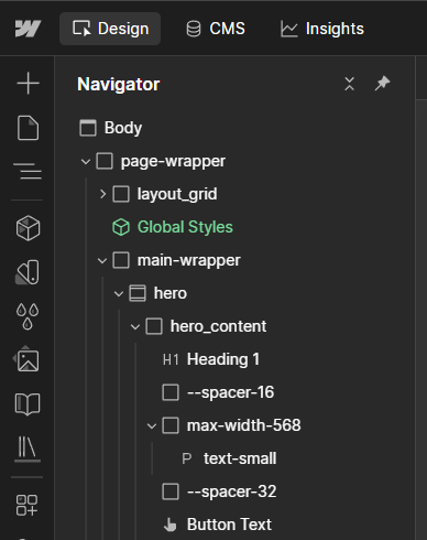
Spacers can be named with a leading double hyphen — --spacer-16,
--spacer-32. This is a purely cosmetic change: it adds no styling and alters
nothing in the rendered page. Its only job is to make the structure easier to read — the
prefix groups every spacer at the top of the class list and sets spacers apart at a glance
in the Navigator, where an empty utility div is otherwise easy to mistake for a real
layout element.
A class name cannot begin with hyphens, yet Webflow accepts the entry in the Designer.
It strips the leading hyphens when the site is published, so the markup ships a
conventional class name: --spacer-16 in the Designer becomes
spacer-16 in the output.
The prefix is therefore an authoring-time device only. It orders and groups spacers
while you build, then disappears from the page. Keep that in mind when you write custom
CSS: target .spacer-16, never .--spacer-16 — the second form
never reaches the published markup.
Pick one form and keep it
Because the hyphens are removed on publish, --spacer-16 and
spacer-16 are two separate classes in the Designer but the same
.spacer-16 in the published CSS. If both exist in one project, their
declarations land on the same selector, the later rule wins for every property they share,
and a spacer quietly takes a value that was defined somewhere else entirely.
The mistake is hard to spot, because in the Designer the two classes look unrelated and
each shows its own, correct values. Decide on one convention at the start of the project
and stay with it across every spacer.
Padding / Margins
(Probably rarely happens)
In other frameworks, creating similar uses for padding and margin is quite common. If you see the benefit of this approach, you can create global classes in a similar way to spacer.
Set padding
(top, bottom, left, right)
(top, bottom) - Vertical
(left, right) - Horizontal
(Vertical, Horizontal)
(top)
(bottom)
(left)
(right)
class name
padding-36
padding-v-36
padding-h-36
padding-vh-36-18
padding-t-36
padding-b-36
padding-l-36
padding-r-36
Margins are created in the same way.
Remember
1. If the spacer is the same between all elements inside a parent with flex or grid , add gap .
2. Creating global classes for padding and margin is quite rare. Instead of creating these classes, it's better to directly add styles to the selected class.
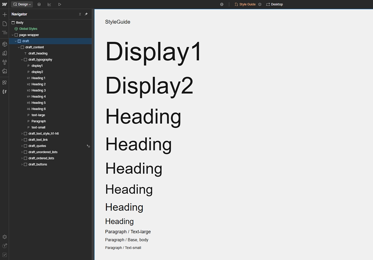
Style Guide
Style Guide is a file used for assigning styles that are not included in Variables – here you can set, for example, text-transform: uppercase and other styles for classes and tags.
A hint system has been added in the Code Embed with class draft-style .
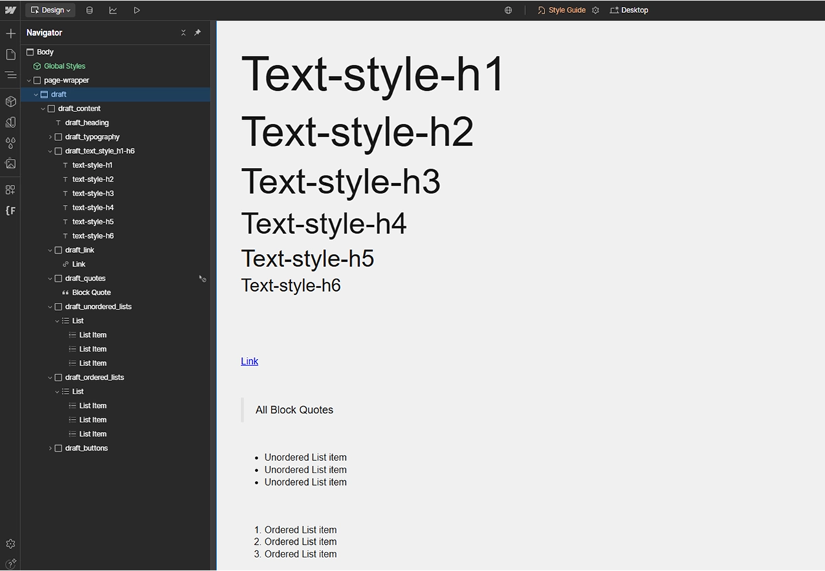
text-style-h1/h6 → these are classes that have the same styles as their respective h1-h6 counterparts. You add them if you want to override specific text styles.
If you need h1 to temporarily have the same styles as h2 , add the class text-style-h2 to h1 . This way, you won't override the base value of h1 .
Style Button and its variants are created using the combo class .
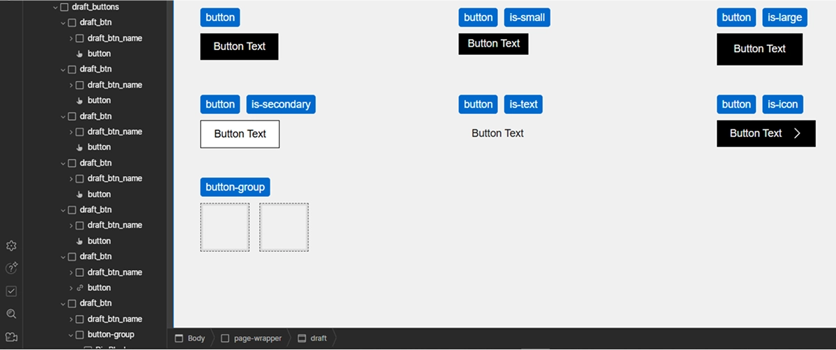
Layout Grid
In sf-starter , a grid has been added to help with checking the layout of elements.
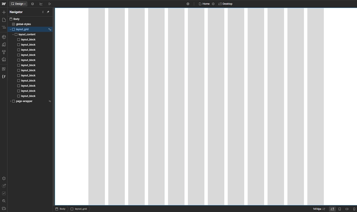
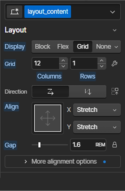
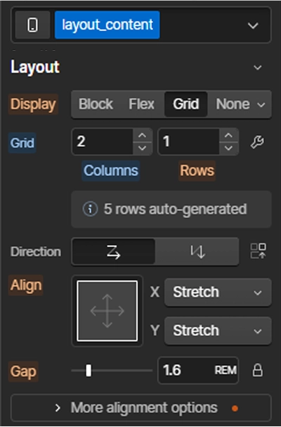
If you have already set all variables, including the containers for the page, select the div with the class .layout_content , which has the display: grid property, and set the number of columns for the appropriate breakpoints . Add the appropriate gap .
Base (Desktop)
Mobile
Remember
1. You can customize the grid color in the Variables / Colors cl-layout-block tab.
2. You can temporarily disable the grid by setting display: none on .layout_grid .
3. After setting up all the styles for layout grid , create a component and place it on the other pages.
4. After finishing the work on the page, remove the layout grid .